
5 Opt-In Page Tweaks That Skyrocket Conversions
Apr 23, 2025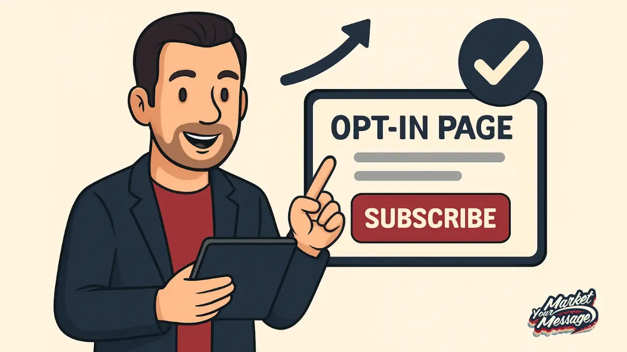
Ever landed on a website, saw a bright, shiny box asking for your email, and thought, "Hmm... should I?"
That's an opt-in page working its magic—or at least trying to.
Opt-in pages are your gateway to building a loyal audience, generating leads, and ultimately driving sales.
But here’s the thing: not all opt-in pages are created equal.
Some capture attention immediately and convert visitors like crazy.
Others... well, they just sit there like a lonely kid at prom, ignored and awkward.
If your opt-in page isn’t performing the way you’d like, a few strategic tweaks might just make all the difference.
In this guide, we're going to dig deep into five specific tweaks that can skyrocket your opt-in conversions.
These aren't theoretical ideas; they’re actionable changes you can implement today.
Ready to turn your opt-in page into a conversion powerhouse? Let’s dive in!
Why Opt-In Pages Matter in Digital Marketing
Imagine throwing a party but forgetting to send out invites. That’s your business without an effective opt-in page. Opt-in pages serve as the bridge between your brand and your audience.
They capture crucial contact information, allowing you to nurture leads and build lasting relationships.
Without a solid opt-in strategy, you’re leaving potential revenue on the table. A strong email list is like digital gold—an asset that appreciates over time.
Plus, email marketing boasts an ROI of 4200%—yup, you read that right. For every $1 spent, you can expect a return of $42. [1]
Impressive, right?
The reality is simple: the better your opt-in page, the bigger (and more engaged) your email list will be. And bigger lists mean bigger profits.
 🚀 Want to Build Your Email List Faster?
Don't guess your way to 1,000 subscribers.
Download The 1K Subscriber Blueprint - a free, step-by-step guide that shows you how to grow your email list with the same strategy used by top creators.
📋 Table of Contents (click to expand)
Common Mistakes That Hurt Conversions
You could have the best offer in the world, but if your opt-in page has issues, conversions will tank. Some common mistakes include:
-
Overwhelming Forms: Asking for too much information upfront turns people off.
-
Weak Headlines: If the headline doesn’t grab attention, visitors won’t read further.
-
Bad Design Choices: Ugly or cluttered pages scare people away.
-
Lack of Trust Signals: No testimonials, no badges, no credibility = no conversions.
Recognizing these pitfalls is step one. Avoiding them is step two. And that’s what we’re about to tackle, starting with your lead magnet.
Tweak #1: Create an Irresistible Lead Magnet
Think of a lead magnet like a bribe—but a good kind. You're offering something valuable in exchange for someone's email address. The better your bribe, the more likely people are to hand over their information.
So, how do you create a lead magnet that people actually want?
Understanding Your Audience’s Pain Points
First, you’ve got to get inside your audience's head. What keeps them up at night? What do they struggle with daily? Your lead magnet should offer an immediate solution to one of their biggest problems.
Here's a quick checklist:
-
Identify their pain point.
-
Offer a quick win or instant gratification.
-
Make it highly specific (no generic advice!).
For example, if you run a fitness blog, offering a generic "Ultimate Guide to Fitness" won’t cut it. But a "7-Day Flat Belly Meal Plan for Busy Moms" hits a nerve—and converts like crazy.
How to Design a Lead Magnet That Converts
Once you know what to offer, you have to make it look appealing.
-
Use a catchy title that promises clear results.
-
Design a visually attractive cover (even for PDFs or checklists).
-
Keep it short and sweet—people want fast results, not a novel.
-
Emphasize instant delivery ("Get it now!" or "Download immediately").
Pro Tip: Always tie your lead magnet to your paid offer. If your lead magnet solves Problem A, your paid product should solve Problem B, C, and D.
Remember, the goal isn’t just to get the opt-in. It’s to start a relationship that leads to a sale.
Tweak #2: Simplify Your Opt-In Form
People are lazy online. I mean, really lazy. The more fields you put in front of them, the more excuses they’ll find not to fill them out. Your mission?
Make opting in so easy that even a distracted toddler could do it.
Less Is More: The Power of Minimal Fields
Seriously, name and email. That’s it. Maybe just email. Every extra field drops your conversion rate by about 10%. [2]
Here’s why:
-
Short forms feel less intimidating.
-
People value their time and privacy.
-
You remove friction from the process.
Think about it: if someone lands on your page and sees a whole life story questionnaire, they’ll probably hit the back button faster than you can say “wait!”
Stick to essentials at the start. You can always gather more information later through email engagement and surveys.
Smart Placement of Forms for Maximum Visibility
Form placement can make or break your conversion rates. Here’s where to put your form for best results:
-
Above the fold: So users don't have to scroll to see it.
-
Exit pop-ups: Capture attention right before they leave.
-
In-line with blog content: Seamlessly integrate offers into articles.
-
Sidebar widgets: Great for blogs and resource-heavy sites.
Mix and match placements and use heatmaps to see where people are clicking most.
Quick Tip: Always include a strong CTA (Call To Action) right near the form. Something like “Get Instant Access” or “Download Your Free Guide” works wonders.
Tweak #3: Write a Magnetic Headline
Your headline is like the pick-up line at a bar. If it’s bad, you’re getting ghosted.
A killer headline can literally double your conversion rate. It’s the first thing people read, and it sets the tone for everything that follows.
Characteristics of a High-Converting Headline
Want a headline that hooks readers instantly? Make sure it’s:
-
Clear and specific. (No guessing games.)
-
Benefit-driven. (What's in it for them?)
-
Emotionally charged. (Trigger curiosity, excitement, fear, or urgency.)
-
Short and punchy. (Aim for 10-12 words.)
Some proven formulas include:
-
"How to [Achieve Desired Result] in [Short Timeframe]"
-
"The Ultimate Guide to [Big Goal]"
-
"7 Mistakes [Target Audience] Make (and How to Avoid Them)"
Emotional Triggers That Boost Sign-Ups
Humans are emotional creatures. Your headline should tap into feelings like:
-
Fear of missing out (FOMO): "Don’t Miss Out On This Exclusive Offer!"
-
Greed: "Unlock The Secrets Top Influencers Don’t Want You To Know"
-
Curiosity: "What Happens When You Drink This Every Morning?"
Use power words like “instant,” “proven,” “secret,” and “ultimate” to spice things up.
Remember: If your headline doesn’t stop them dead in their tracks, nothing else you do on the page will matter.
Tweak #4: Use Eye-Catching Visuals
You ever hear the phrase “a picture is worth a thousand words”? On your opt-in page, it might be worth a thousand emails. Visuals aren't just decorations—they guide attention, build trust, and drive action.
Importance of Professional, High-Quality Images
Low-quality, blurry, or cheesy stock images scream “amateur hour.” If your opt-in page looks sketchy, people will hesitate to share their personal info.
But when you use crisp, professional visuals, your page gains instant credibility.
Here’s how great images can supercharge conversions:
-
Visual storytelling: Show what your lead magnet will help them achieve.
-
Product mockups: Make digital downloads look tangible and real.
-
Author photos: Build trust with a face behind the offer.
-
Icons and illustrations: Help break up text and improve flow.
People process images 60,000 times faster than text. So before they read a word, they’re already judging you. Make sure your first impression is a good one.
How Colors and Fonts Impact Conversions
Colors and typography aren’t just style choices—they’re psychological tools.
Color psychology can influence emotions and actions:
-
Red = urgency, excitement
-
Blue = trust, reliability
-
Green = calm, growth
-
Orange = enthusiasm, action
-
Black = luxury, power
Use contrasting colors to highlight CTAs so they pop off the page. A dull, blended-in button gets ignored. A bold orange or red CTA? Clicked all day long.
As for fonts, keep it clean and readable:
-
Avoid overly fancy scripts.
-
Use a hierarchy (headline, subheadline, body).
-
Make sure it’s mobile-friendly.
Consistency is key. Pick two fonts max and stick with them across the entire page. When visuals and text flow together, your opt-in page becomes a conversion machine.
Tweak #5: Add Powerful Social Proof
Imagine you’re at a restaurant. One place is empty, the other’s buzzing with happy diners. Which one do you trust more? That’s social proof in action—and your opt-in page needs it badly.
Different Types of Social Proof You Can Use
Social proof is all about showing potential subscribers that others already trust you. It’s the “don’t just take my word for it” of marketing.
Here are some killer types of social proof:
-
Testimonials: Short quotes from happy customers or readers.
-
Numbers: "Join 10,000+ subscribers" gives a powerful boost.
-
Case studies: Show how your advice has helped real people.
-
Media mentions: Logos from Forbes, Business Insider, etc.
-
Influencer endorsements: If someone well-known loves your stuff, say so.
Even if you’re just starting, you can use early feedback from beta testers or social comments to build trust.
Best Practices for Displaying Testimonials and Reviews
Not all testimonials are created equal. A generic “This was great!” doesn’t cut it. You want short, punchy blurbs that speak directly to the results and benefits.
What makes a testimonial work?
-
Specificity: “I got 157 new leads in 7 days!” > “It helped my business.”
-
Photos: Add faces to names—humans connect with humans.
-
Real names and titles: Build authenticity and transparency.
Display testimonials near CTAs or lead magnets for max impact. Sprinkle them throughout the page so visitors are constantly reminded, “Other people trust this. Maybe I should too.”
Pro Tip: Use video testimonials if you can—they’re engaging, build trust, and hard to fake.
Bonus Tips for Even Higher Conversions
So you’ve nailed the basics, and your page looks fire. Want to squeeze out even more conversions? Time to go next level.
A/B Testing Your Opt-In Page
Think your page is perfect? Test it anyway. A/B testing is the secret weapon of high-converting marketers.
What you can test:
-
Headlines
-
Button text
-
Colors
-
Layouts
-
Images
-
Form fields
Tools like Google Optimize, Optimizely, or ConvertKit’s built-in features make it easy.
Example: Just changing “Sign Up” to “Get My Free Guide” can boost conversions by 20-30%. Sounds small, but multiply that over time? Huge difference.
Rule of thumb: Test one element at a time and let each test run long enough to gather reliable data.
Optimizing for Mobile Devices
More than half of all web traffic comes from mobile. If your opt-in page isn’t mobile-optimized, you’re basically ignoring half your audience.
Here’s what to do:
-
Use responsive design (auto-resizes to any screen).
-
Keep forms short—no one wants to type a novel on a phone.
-
Make buttons big and thumb-friendly.
-
Load fast—slow pages get abandoned.
Test your page on multiple devices. If it doesn’t look amazing on a smartphone, fix it ASAP.
Pro Tip: Use AMP (Accelerated Mobile Pages) for even faster load speeds on mobile.
Conclusion: Small Tweaks, Big Results
Here’s the truth—most people think their opt-in page just needs more traffic. But in reality? It needs better conversions. You don’t need 10,000 visitors a day if your page can’t convert 100.
That’s where these small but powerful tweaks come in.
From offering an irresistible lead magnet to crafting headlines that command attention, from simplifying your form to optimizing visuals and leveraging social proof—every change stacks up.
These aren’t just tips. They’re conversion boosters tested by top marketers and brands who’ve built massive email lists from scratch.
The beauty is you don’t need a full redesign. You just need to focus on the user experience.
- How easy is it to understand your offer?
- How trustworthy does your page feel?
- How quickly can someone take action?
Start with one tweak at a time. Track your results. Refine. Repeat.
Soon, you’ll watch those opt-in numbers soar—and wonder why you didn’t do this sooner.
FAQs
1. How many fields should my opt-in form have?
Keep it simple. Ideally, just one—email. At most, two (email and first name). Every additional field creates friction and lowers your conversion rate. Start small and gather more details later through your email sequence.
2. What is the best type of lead magnet?
The best lead magnet solves a specific problem fast. Think quick wins: checklists, templates, mini-courses, or toolkits. Make sure it's easy to consume and provides immediate value. Tailor it to your niche and audience’s pain points.
3. How often should I update my opt-in page?
Review your opt-in page quarterly. Update it whenever your offer changes, your branding evolves, or performance starts slipping. Regular A/B testing will also help you keep things fresh and optimized.
4. Can I use video as a lead magnet?
Absolutely! Video is engaging and can increase trust and clarity. Short how-to videos, tutorials, or behind-the-scenes content work great. Just ensure it's mobile-friendly and doesn’t require long loading times.
5. What are the biggest mistakes to avoid on an opt-in page?
-
Overcomplicating the form
-
Using vague or weak headlines
-
Ignoring mobile optimization
-
Not offering a clear benefit
-
Forgetting to build trust (no testimonials or social proof)
Fix these, and you’re already ahead of 90% of marketers out there.
🚀 Want to Build Your Email List Faster?
Don't guess your way to 1,000 subscribers.
Download The 1K Subscriber Blueprint - a free, step-by-step guide that shows you how to grow your email list with the same strategy used by top creators.